1/3. Colour Handling
3/3. Colour Handling
2/3. Colour Handling
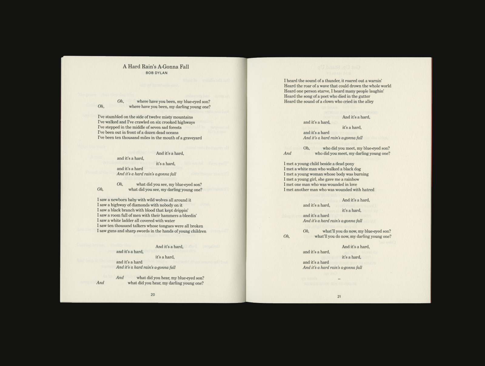
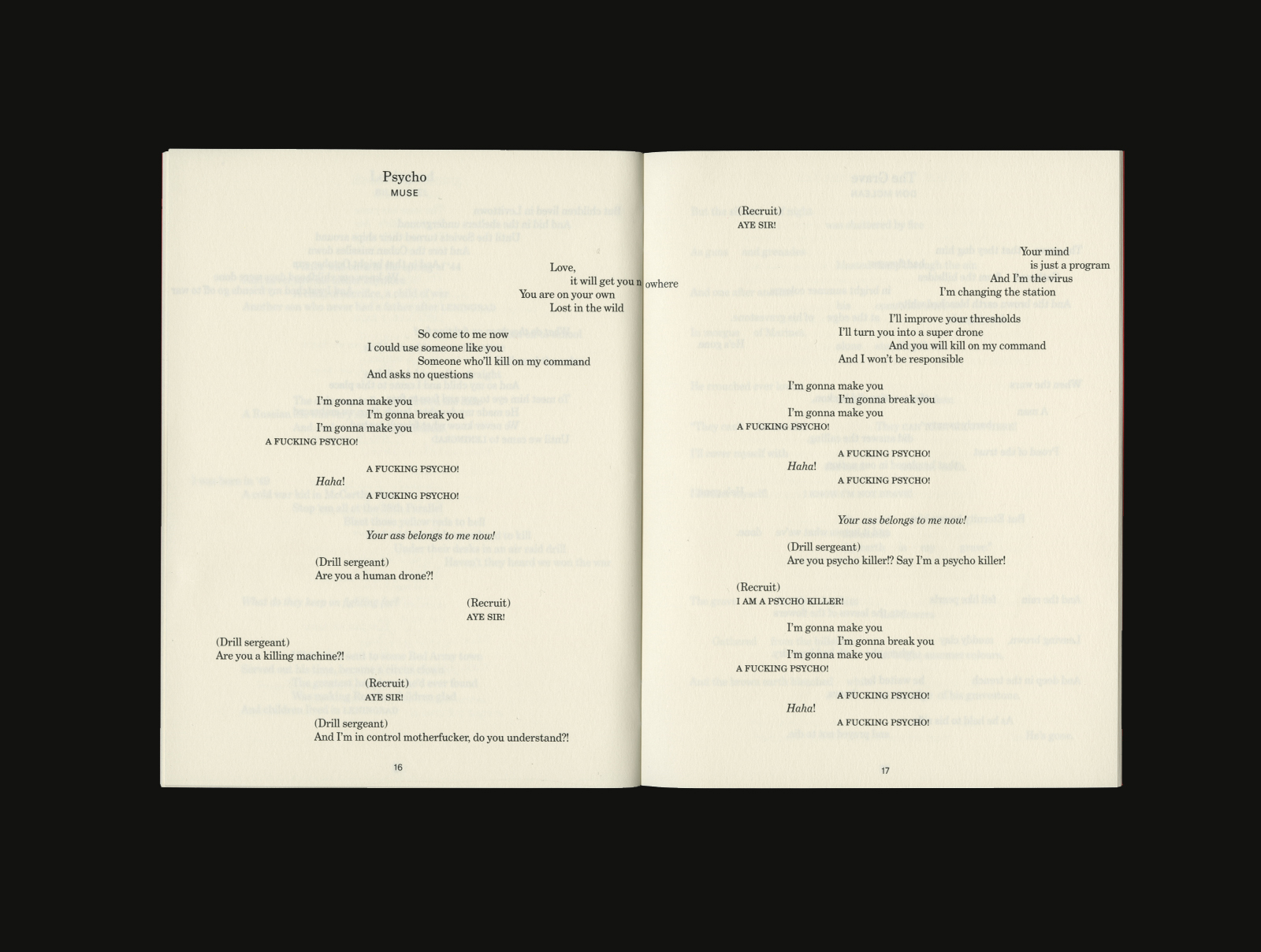
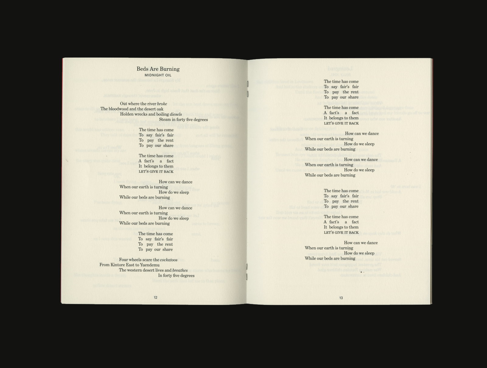
Book design, Published by Discipline, 2022
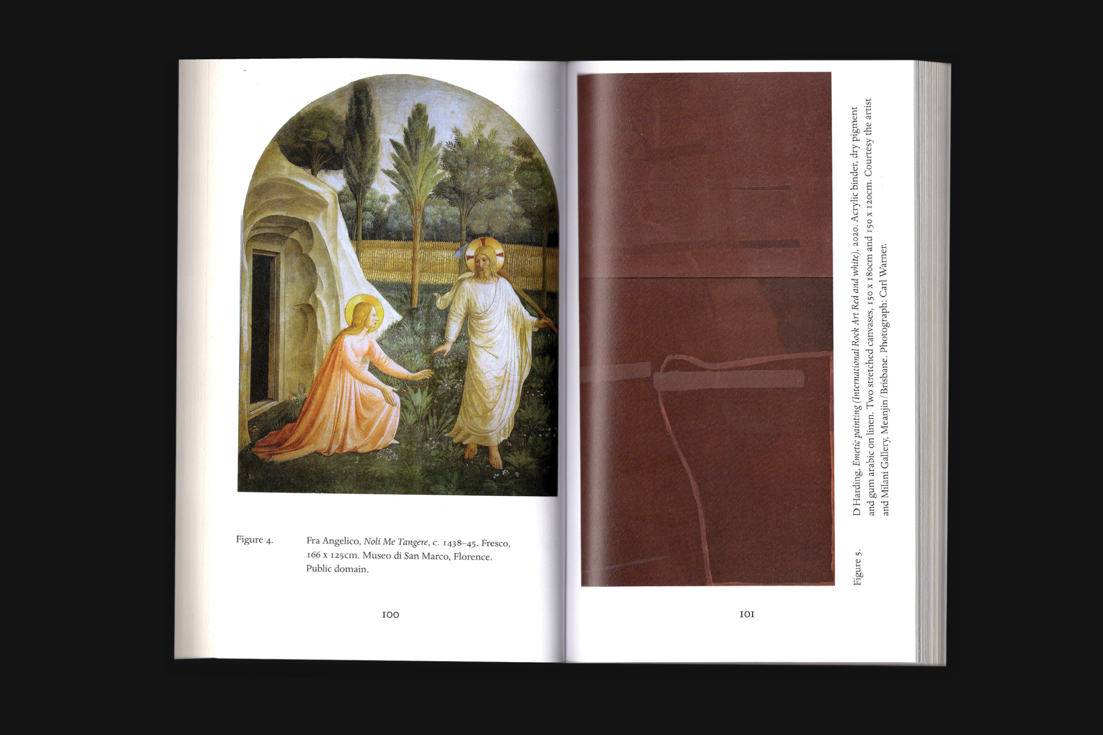
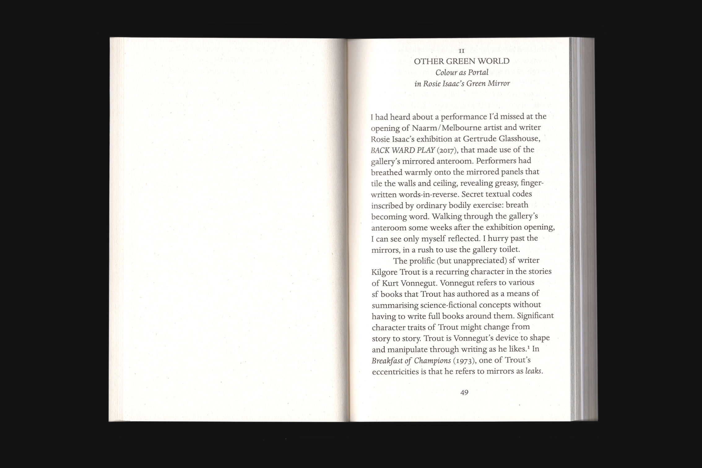
Colour Handling by David Egan comprises a series of essays on colour written from a painter’s perspective. Each essay responds to an occurrence of colour in an artist’s work: Jutta Koether’s red paintings; Rosie Isaac’s green mirror; Tony Conrad’s Yellow Movies; Derek Jarman’s Blue; and Etel Adnan’s paintings of Mount Tamalpais.Edited by Helen Hughes and Amy Stuart, with introduction by Tessa Laird.
188 pages, 105 × 175 mm, Softcover, BW with colour insert
Edition of 400
ISBN 978-0-9945388-5-7